Usability
RSSMonster adapts its reading experience to both the amount of detail you want and the screen you are using. On a desktop, choose a view from the View menu in the toolbar. On mobile devices, RSSMonster presents a streamlined interface that keeps the main reading and organization tools close at hand.
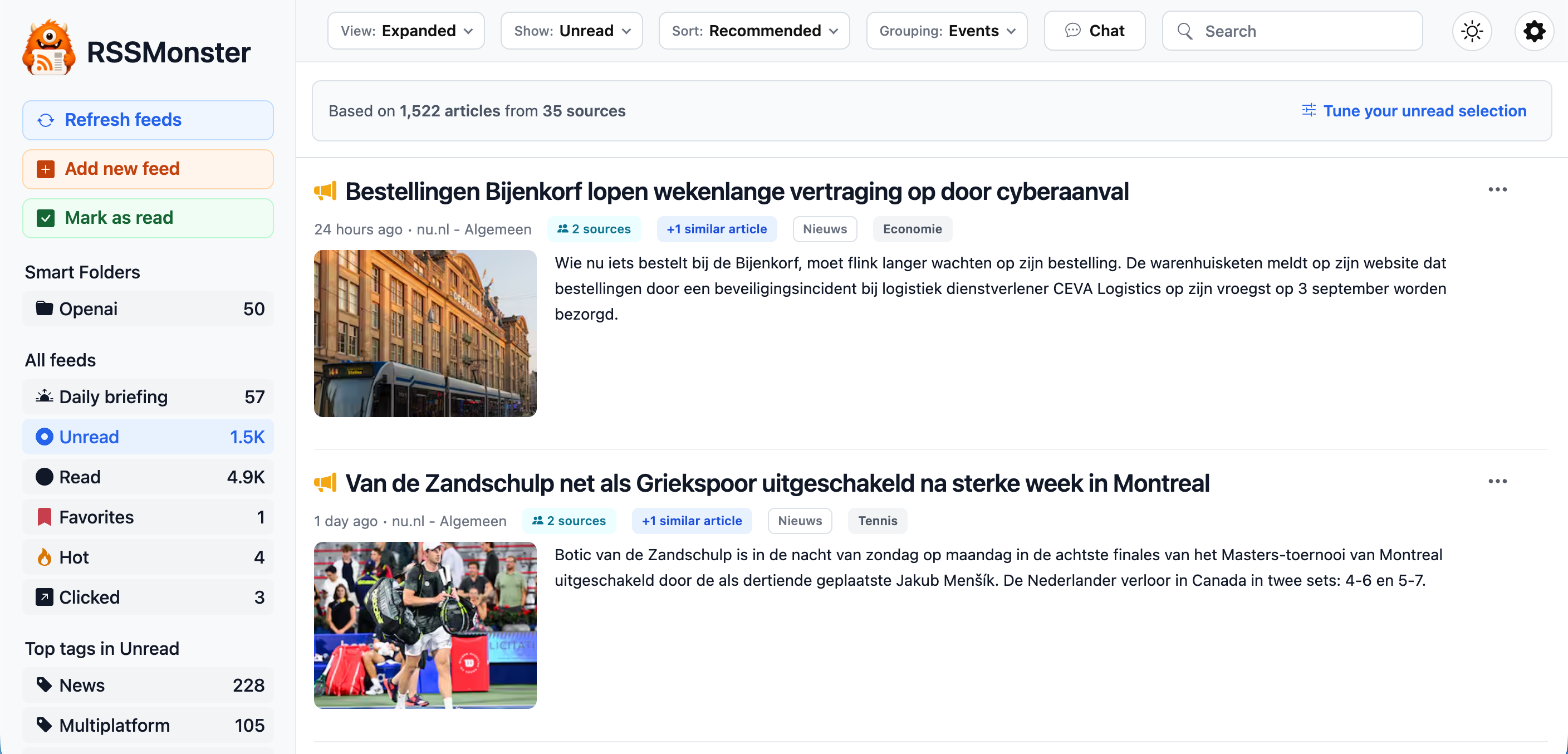
Expanded Mode
Expanded mode gives article content most of the available width. Each article appears directly in the main stream with its title, source information, tags, image, and content preview. This mode works well when you want to scan articles without switching between a list and a separate reading pane.
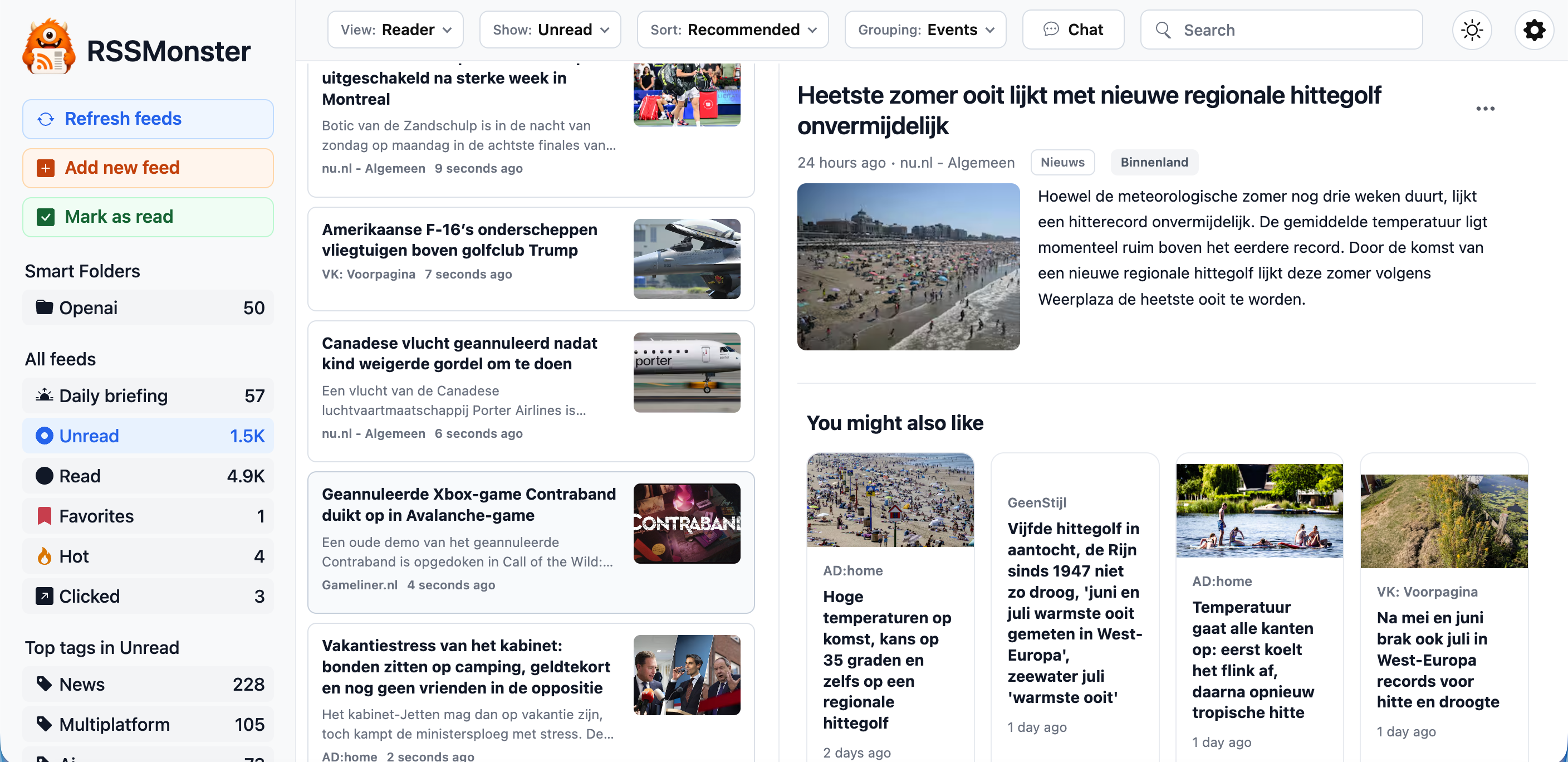
Reader Mode
Reader mode uses a three-column layout: navigation on the left, a compact article list in the middle, and the selected article on the right. It is similar to the reading experience offered by RSS readers such as Feedbin and is useful when you want to move quickly through many articles while keeping the current story visible.
Reader mode is designed for keyboard navigation. See Keyboard Shortcuts for the available commands. Moving through articles with those shortcuts also marks the articles you leave as read, as described in Marking Articles Read.
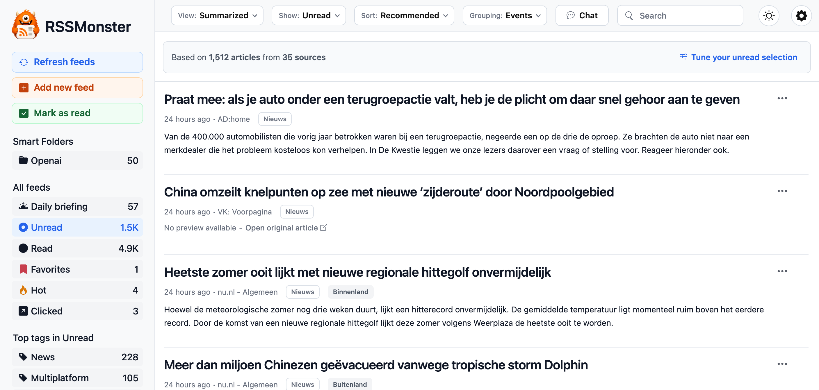
Summarized Mode
Summarized mode presents articles as a compact stream of titles, metadata, and short summaries. It reduces visual detail while retaining enough context to decide what deserves a closer look. When no preview is available, RSSMonster offers a link to the original article instead.
Summary Bullets and Headlines
Summary Bullets shows available generated summary bullets and is offered when AI is enabled. Articles need completed analysis to have those summaries. Headlines is the most compact list. Automatic scroll-based marking as read does not run in Headlines mode; use explicit article actions instead.
Reading controls and preferences
Status, sort, grouping, and view mode are separate controls. Select a status to choose a collection, a sort to order it, and grouping to combine related coverage. AI-dependent status, sort, and grouping choices appear only when enabled. See Scoring, Events, and Daily Briefing.
Article controls include read/unread state, bookmarks, opening the original, and, when available, related stories, story sources, score explanations, and More like this / Not interested feedback. Use those feedback actions to refine personal interest; they are different from changing read state.
The desktop theme control offers System, Light, and Dark. System follows the operating-system preference. Full Settings and theme controls are available in the desktop shell; the mobile gear opens the smaller Options sheet.
Mobile Experience
RSSMonster provides responsive layouts for phones and tablets. Compatible browsers support installation as a Progressive Web App, so RSSMonster can be launched from a device’s home screen. Pull down on an article collection to reload stored results. Use Refresh feeds in Options to request publisher fetching. In portrait mode, swipe an article to the right to toggle its bookmark.
The mobile settings menu is intentionally slimmer than its desktop counterpart. It exposes a limited set of options chosen for the mobile reading experience while leaving advanced configuration available in the full desktop interface.
Landscape
The landscape layout is optimized for wider mobile and tablet screens, such as an iPad held horizontally. It condenses the navigation and controls while retaining the full article-reading experience.
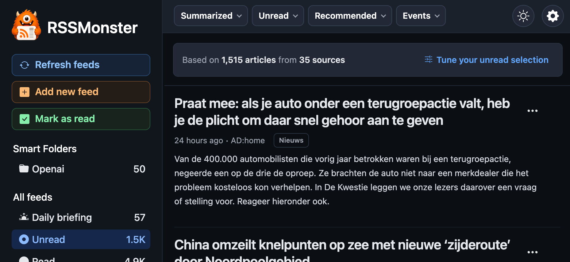
Portrait
The portrait layout is optimized for phones and other narrow screens. It uses a single-column article stream and compact controls so titles and summaries remain readable without horizontal scrolling.
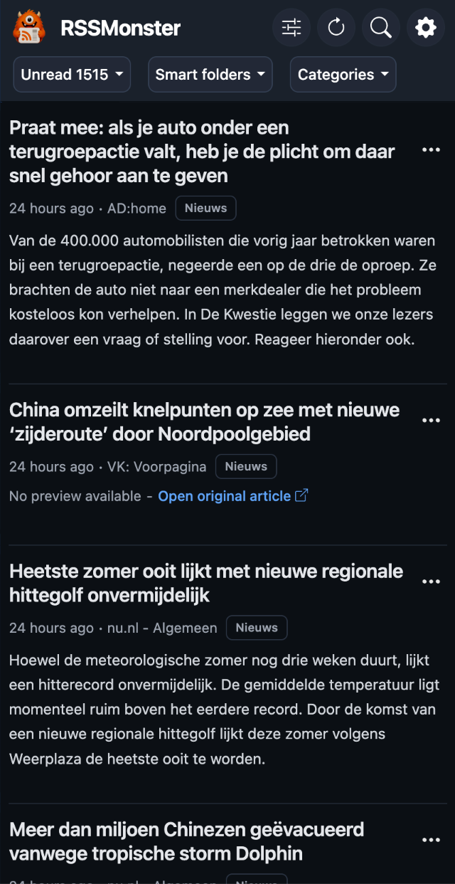
You can switch views at any time without changing your feeds, folders, or article state. Choose the layout that best matches whether you are scanning, reading in depth, or working on a smaller screen.
Responsive layout reference
Layout follows viewport width, rather than device name or orientation alone:
| Width | Navigation and reading controls |
|---|---|
| Below 768 px | Single-column reading with compact toolbar and Options sheet. |
| 768–879 px | Persistent sidebar with compact toolbar and Options sheet. |
| 880 px and above | Desktop toolbar, full Settings, and Reader view choice. |
Reader view is not offered in the compact/mobile view menu. A tablet can use different shells depending on window size. See Keyboard Shortcuts for keyboard controls and Web App and Notifications for installation and Push permissions.
Score thresholds
When AI is enabled, Settings → Scores provides minimum advertisement, sentiment, and quality component thresholds on a 0–100 scale. Higher advertisement scores mean less promotional content. These controls affect eligibility; they differ from the normalized 0–1 combined quality filter in Search. Pending or failed inferred analysis is not treated as a completed low score, while deterministic Action overrides still apply.